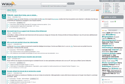
 The best example of this that I've seen is on a new site still in beta called Wikio. This 5 minute screencast details what they've done (my first attempt at screencasting).
Looking back, it makes sense that this advancement would appear now. People have been using keywords to describe content for a long time, but there haven't been obvious ways to leverage that data within a web site.
Here are some of the major leaps in web site navigation interfaces:
- List view. Lists of links to pages on the Internet made it possible to get from here to there and then on again to the next place.
- Left-hand column. The invention of tables allowed us to break up pages into columns. The left-hand side of the page turned into a natural location for lists of access points to more stuff.
- Search boxes and results pages. The search box became a navigational layer on top of the list view. It narrowed large lists to more manageable sizes.
- Tab-based navigation. Left-hand columns quickly became overcrowded. They were fine for people who were willing to work to find site-level links, but they were terrible in aiding discoverability. Tabs were simple and impactful.
- Tag-based navigation. This is a new layer that preempts the search box in a way. The visual representation of it is a tag cloud, but the interaction is more like a pivot.
UPDATE: I showed he wrong version of Jon Udell's tag-driven search engine in this screencast. He built one that allows you to dive in and jump out of a large collection of InfoWorld articles as you pivot on tags here: http://udell.infoworld.com:8005/. He calls it the Metadata Explorer.
Comments:
Re: Pivoting on tags to create better navigation UI
by
mahalie
on Wed 12 Apr 2006 03:27 PM EDT
Love the screencast format, especially for this topic which could quickly turn into a convoluted explanation, even with static screenshots.
Comments:
Re: Pivoting on tags to create better navigation UI
by
Beach
on Sat 15 Apr 2006 02:13 AM EDT
Really cool Matt! First, do more screencasts. Second.. wikio seems to have done a decent job with a very complex issue... tag navigation. I've been thinking a lot about tag heirarchies lately, tags of tags I guess. The more things you tag the more there is a need for better navigation and findability of those objects. If I tag an object that's a book about architecture in helsinki. For me, first it's a book, then it's about architecture, then it's about helsinki (unless it's the band). So I would prefer to structure it in that manner... but others might want to do it differently. With the use of multiple tags, this kind of pivoting can happen as delicious, and my web, etc. try to do, but it certainly isn't a comfortable experience. I hope more people work on this problem.
Thanks again.
-beach
Thanks again.
-beach
